ADHD Women’s Wellbeing Website Rebuild for Enhanced Accessibility
Kate Moryoussef of ADHD Women's Wellbeing approached me with a critical challenge: her Squarespace website, though rich in valuable content, inadvertently created barriers for her target audience, women with ADHD. My mission was to transform her online presence into a truly intuitive, supportive, and accessible space, completing the project by 9th July, well ahead of her book launch.
What I Delivered for ADHD Women's Wellbeing:
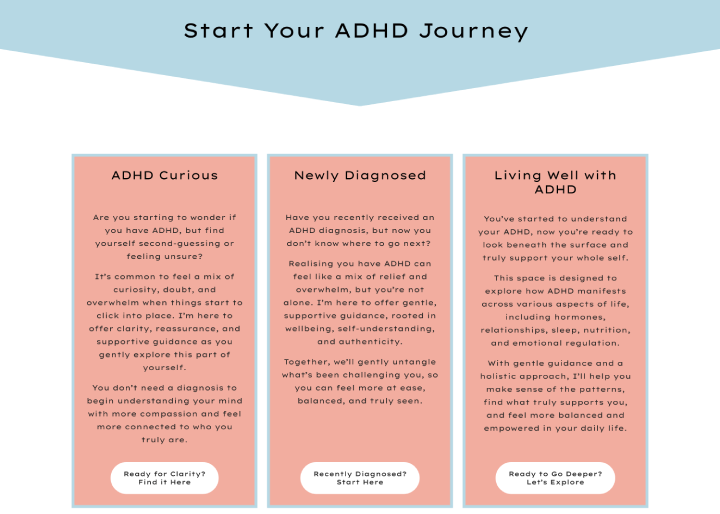
Streamlined Navigation & User Journeys: I completely restructured the website's navigation, reducing clutter and decision fatigue. The homepage was redesigned to prominently feature three clear user journeys ("Newly Diagnosed," "Undiagnosed & Seeking Support," and "Ready for Deep Change") acting as direct calls to action, guiding users immediately to relevant content without overwhelming them. The main menu was simplified to a single line, improving clarity and ease of use.
Optimised Content Readability & Presentation: Recognising the unique needs of an ADHD audience, a major focus was on content presentation. I implemented a consistent and accessible font strategy across the entire site (Montserrat 18px for body text, Josefin Sans for headings). Content was meticulously "chunked" into short, digestible paragraphs, with clear subheadings and lists to improve scannability and comprehension. I also ensured optimal colour contrasts for text, especially for headings, using Kate's brand palette effectively whilst prioritising readability over aesthetic preference where necessary.
Refined Calls to Action (CTAs): I simplified and clarified the website's calls to action, replacing vague "Click here" links with descriptive, action-oriented phrases (e.g., "Download Your Free ADHD Guide," "Find Out About 1-to-1 Coaching"). This reduces confusion and guides users efficiently.
Strategic Page Rebuilding & Enhancement:
Homepage: Redesigned to feature clear, above-the-fold calls to action for the three main user journeys.
About Kate Page: Restructured to focus solely on Kate's personal story and expertise, integrating a dynamic testimonial carousel for social proof.
Working Together Page: Built a comprehensive hub detailing 1-to-1 coaching options and packages, with clear links to membership and contact forms, enhanced by relevant testimonials.
Membership Page: Refined for improved aesthetics and readability, ensuring font and colour alignment with the new branding, and removing distracting elements like emojis.
The Book Page: Transformed into a clean, conversion-focused selling platform, clearly articulating the book's value and purchase points, with chapter-specific resources seamlessly integrated into relevant sections across the broader site.
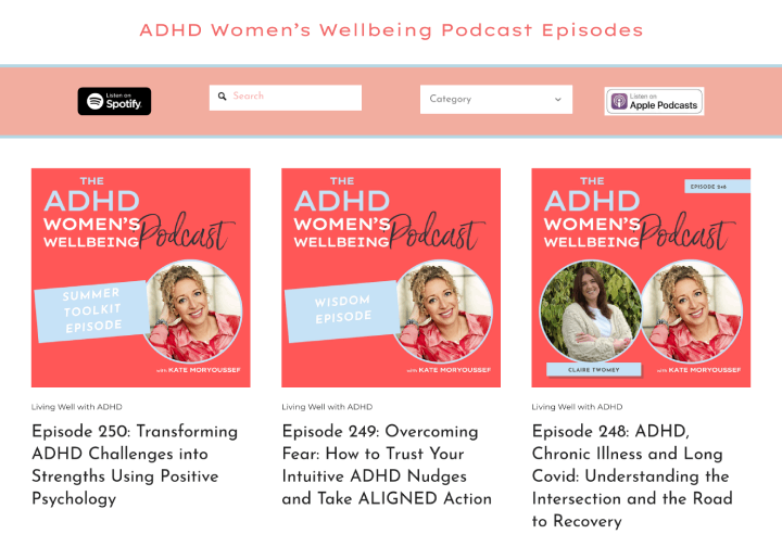
Podcast Page: Enhanced user experience by replacing image-based reviews with a text-based testimonial carousel. I also explored categorisation of podcasts into the three user journeys, adding search and filter functionalities for easy content discovery.
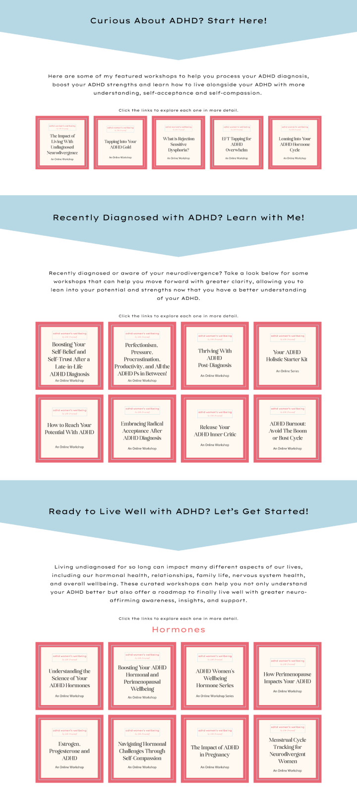
Workshops Page: Created a dedicated page logically split into sections corresponding to the three user journeys, with direct links from individual journey pages for seamless navigation to relevant workshops.
Free Resources Page: Reorganised existing resources into three distinct, journey-based sections, providing direct links from each journey page for targeted access.
Media Appearances Section: Curated to a highly selective 5-10 key links with brief descriptions, leveraging Kate's extensive media presence whilst minimising external redirects and retaining user engagement on the site.
Technical SEO & Accessibility Foundation: Implemented a robust URL redirect plan to ensure a smooth transition and preserve search engine rankings, preventing broken links and "404 Not Found" errors. I also addressed critical technical SEO elements such as page speed optimisation, ensuring the site is mobile-friendly across all devices, and adding alt text to all images for improved accessibility and search visibility.
Seamless Publishing & Testing: Managed a meticulous publishing process using a Squarespace staging environment, ensuring comprehensive pre-launch review and client approval. A rigorous testing protocol, including link verification, form functionality, media playback, page loading speed, and cross-browser/device compatibility, guaranteed a flawless and ADHD-friendly user experience.
Expanding the Partnership: Kajabi Platform Alignment
Following the successful completion of the main Squarespace website rebuild, Kate was so pleased with the results that she enlisted my help for a second, crucial project: aligning her Kajabi platform. This involved a detailed audit and strategic plan to address font styles, sizes, logo, and colour inconsistencies across Kate’s 57 landing, 23 funnel, and 44 checkout pages on Kajabi. This meticulous plan ensures a cohesive brand experience across all of Kate's digital platforms, addressing specific page-level overrides and legacy formatting issues.
Both the Squarespace website rebuild and the Kajabi platform alignment were completed as custom-quoted projects, tailored precisely to Kate's unique business needs and objectives.
This comprehensive work transformed ADHD Women's Wellbeing into an accessible, intuitive, and highly effective platform. Kate can now confidently engage her audience with a site that truly supports their needs, fostering deeper connections and facilitating easier access to her invaluable resources and services.
The Three Clear User Journeys added to the Homepage
Workshops Seperated out for the Three Clear User Journeys
The Search Function added to the Podcast Page
Kajabi Checkout Page with Similar Branding and Theming

Testimonial
“ I recently worked with Karen on revamping my website. I needed something that looked good, felt welcoming, supportive and easy for my community to navigate and that's exactly what Karen delivered.
Karen broke the whole process down into easy steps, showing patience and care every step of the way. The result is a site that reflects my work and values and one that I am proud to share.
If you are looking for someone who will listen to your ideas and translate them into a website that feels like you, I wholeheartedly recommend working with Karen.” - Kate Moryoussef, ADHA Women’s Wellbeing